Selected Work from W Craig Tomlin
UX Research, CRO & UX Design Optimization Portfolio
Welcome to my portfolio. I work across various disciplines with a variety of clients, including eCommerce, B2B, B2C and internal and mobile apps. Over the years, I have worked independently and collaboratively across a diverse portfolio of UX research, CRO and mock-up projects. My expertise in combining Behavioral UX and Usability Testing data to examine the qualitative and quantitative aspects of the user experience provides me with a 360 degree view into website and app optimization opportunities.
I use that 360 degree view to analyze the WHAT is Happening information with the WHY it's Happening information to make far more informed recommendations for improving the UX of small and large websites. For more information, feel free to contact me directly at 1-512-590-2823.
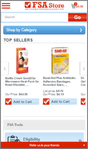
Before
FSAStore.com sells thousands of products that can be purchased online using Flexible Spending Account funds. The desktop version of the store was performing well, but the mobile version had been experiencing increasing traffic but with lower conversion. The FSAStore.com team had conducted A/B testing but with limited success. They wanted to increase conversion on the mobile version of the site. They contacted me for a mobile UX analysis and optimization recommendations.
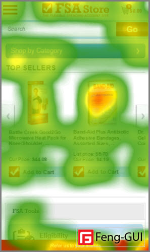
During
I conducted a complete and detailed analysis of the Behavioral UX data coming from their Google Analytics, CRM and back-end sales systems. I also conducted usability testing, a 5 second test and eye tracking to evaluate where user experience or usability issues may have been causing poorer performance. The output was a comprehensive UX research analysis document with screen shots, videos and mockups demonstrating the UX design optimizations.
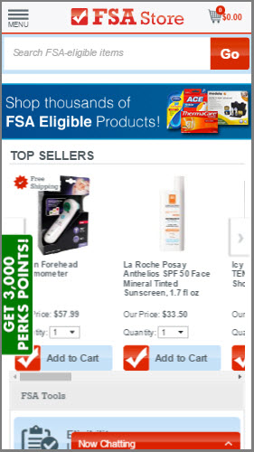
After
Among the recommendations was to add the 'Menu' label to the hamburger menu. In addition, the Categories button was not attracting attention, so the substitution of the banner with value statement was added. Increasing the size of the product descriptions, adding a quantity selector and increasing and enhancing the CTAs was recommended to attract more attention. Results have been very good with significant improvements in product clicks and conversion.
"Craig focuses on company-specific data to provide tailored insights for website improvements. Following his site audit, we took away a better understanding of our own customers and how we can better serve them. His review and analysis were well thought out and thorough. I would recommend Craig to anyone looking to conduct a custom website audit." Mike Bonfigli, Web Product Manager, FSAStore.com

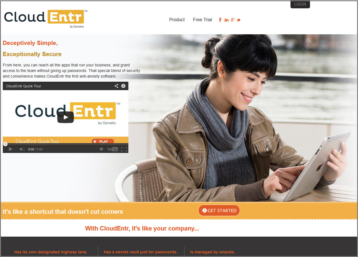
Before
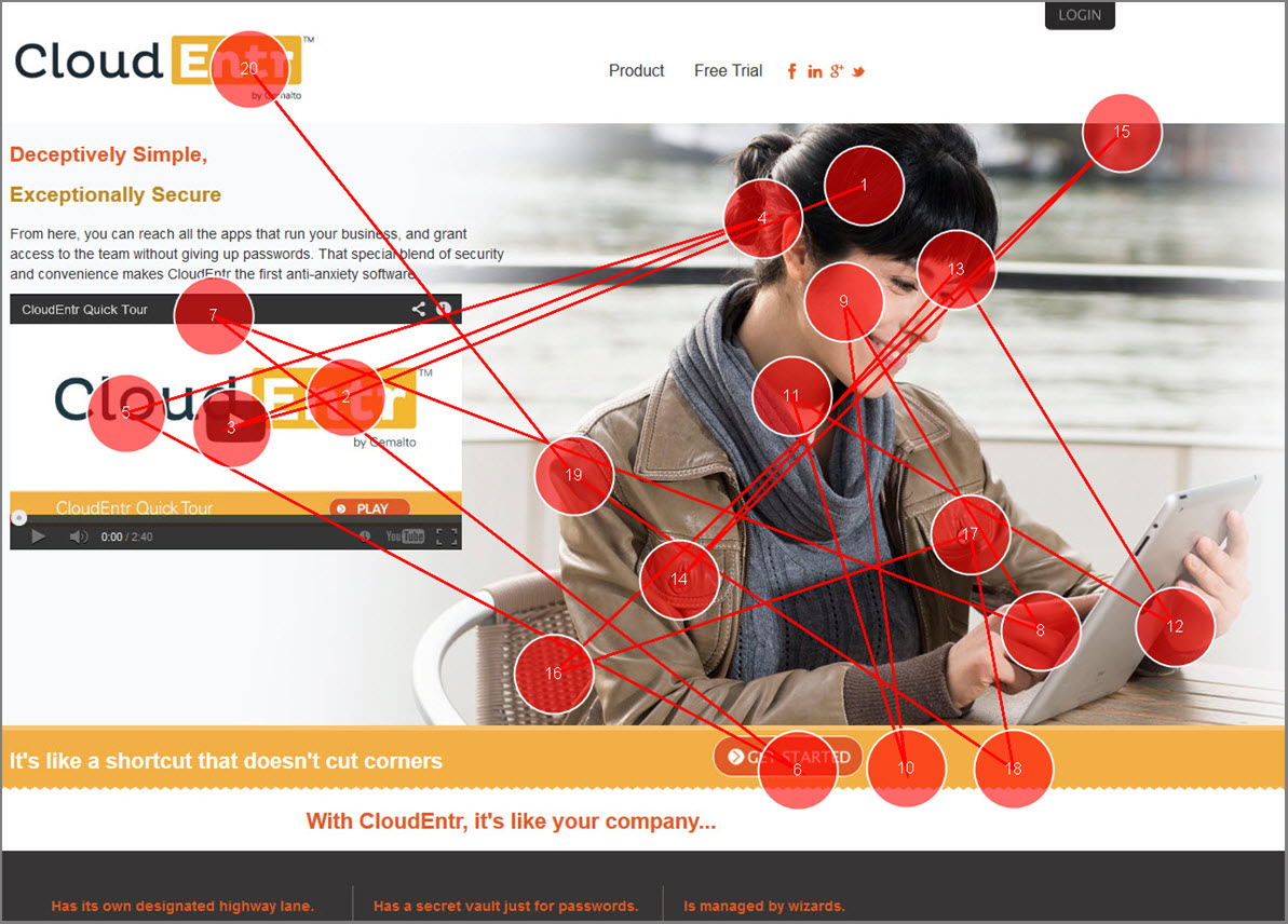
CloudEntr was a beta cloud security and authentication product Gemalto, a security and authentication firm, was creating. Gemalto's goal was to roll out the beta of CloudEntr as a test of the product in the marketplace. If the test was successful, the product would eventually be incorporated into the Gemalto Brand's suite of security and authentication tools. I was asked to conduct a detailed UX analysis and set of optimization recommendations to increase the number of sign-ups for the CloudEntr beta.
During
For the CloudEntr analysis there were two separate projects. The first I conducted was a detailed SEO (Search Engine Optimization) review with recommendations for target keywords, content audits, information architecture revisions and a strategy for attracting and building organic traffic via high quality calls to action. The second project I conducted was a comprehensive UX and Usability analysis and set of recommendations. Tests including eye tracking, 5 second and usability testing, and a Heuristic review.

After
The SEO recommendations, coupled with the UX analysis and optimization suggestions had a dramatic improvement in the number of beta subscribers CloudEntr received after implementation. Among the recommendations was re-targeting keywords away from 'industry-speak' and more toward typical search queries used to find Cloud security products. The UX and Usability recommendations improved clicks and conversions for sign-ups so much that CloudEntr was eventually re-Branded and added into the Gemalto product suite.

"Craig is awesome. I used him for an analysis and recommendation project prior to launching a new website as part of larger product launch. He performed a comprehensive SEO audit that included great keyword research and content recommendations, in-depth site architecture, and complete UX review of our site. The work was well thought out, insightful and the guy works fast...and most importantly he made me look like a rock star."
Christopher Bartik, Director Customer Acquisition, Gemalto

Before
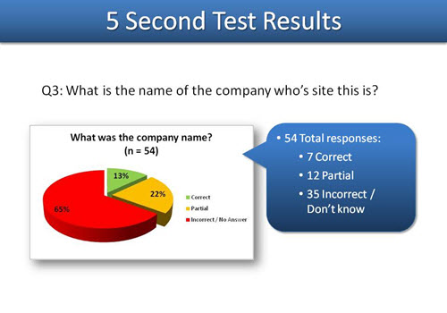
Arthur Rutenberg homes is one of the largest custom and community housing builders in the South East. They sell hundreds of millions of dollars in homes each month. Their website was driving traffic and many home visits, but it needed an update. They were concerned however that without first evaluating any potential new user experience they may inadvertently cause website traffic and thus sales to drop. I conducted a behavioral, heuristic and usability analysis of the existing and proposed wireframes.
During
Based on the analysis of the behavioral UX, heuristic and usability testing results, I determined that there were potential issues with the proposed new design that could cause confusion and task-flow errors. Using 5-second test and other data, I created a new series of rough wireframes to demonstrate how those issues could be overcome with a new layout. The new wireframes addressed many of the usability issues that were happening on the existing site, as well as those on the original proposed new design.

After
The wireframes and other UX, heuristic and usability recommendations were evaluated by the team. Many of my proposed changes were happily accepted and rolled into the final version of the new website. Today the new website is experiencing a number of improvments including; greater number of visits to the critical Plans, Visit Models and Luxury Edition pages. In addition, the improved UX has increased site visits, page duration, decreased bounce rate and is responsible for increased home visits.
"Craig's work on wireframes I was developing realistically gained us several million dollars in revenue with the changes he recommended. His level of detail for actionable changes was jaw dropping and the advice he gave was based on our actual business model, not academics and generalities. We will be using him again when we need real experts." Erik Cocks, Online Marketing Executive, Arthur Rutenberg Homes

Before
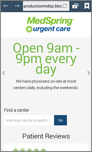
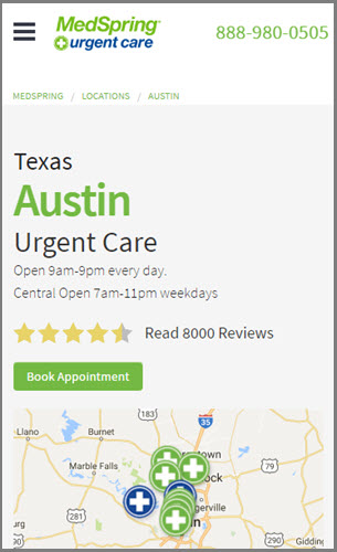
MedSpring Urgent Care is a large chain of urgent health care facilities spread in several major Cities across the US. The original version of their mobile site was not user friendly, according to the many comments they received through their Voice Of the Customer programs. A redesign was needed to make the mobile site easier to use, including using location data to help users find and navigate to the nearest facility to them. I was asked to conduct UX design research to help create the revised site.
During
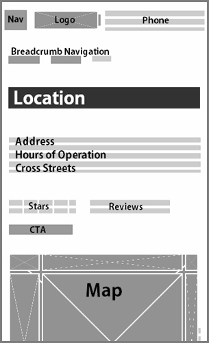
I created a series of UX design research tests including content mapping, information architecture evaluations, usability tests and behavioral UX data analysis. Behavioral UX data from the Google Analytics mobile user engagement reports was especially helpful for evaluating the What Is Happening data. I also conducted mobile usability testing of the existing site and wireframes of the new site. Based on my analysis, I created new wireframes (example above) with an optimized mobile website structure and functionality.
After
The results of the research and revised wireframes were incorporated in the final version of the mobile redesign. Most of the recommended layout, information architecture and functionality was included in the new site. After rollout, the VoC feedback on the mobile experience significantly improved, as users found the site easier to use and more helpful. Data from Google Analytics confirmed that sessions and conversions were up, and visits to some facilities increased by double digit percentages.

Before
Nixon is a high-end watch and fashion retailer skewing to Millennials. Their website home page had what is sometimes called a Tunnel, a decision path which requires the visitor to take action before navigating to the content. Their online store had conversion rates that did not equal in-store rates, and were also lower than the industry norm for eCommerce sites in the same category. I was asked to evaluate the user experience of the site to find issues and recommend optimizations.
During
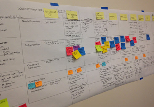
Because of the revenue being generated by the eCommerce channel, concern about changes in the design was higher than normal. I therefore conducted Journey Mapping, Customer Interview and Contextual Inquiries to better define what a typical shopper would expect the experience to be. In addition, I conducted a deep-dive behavioral UX data analysis and remote unmoderated usability testing to provide quantitative and qualitative data for the evaluation.

After
The recommendations for optimizations were delivered to a large group with all product and vendor teams present. The result of the analysis was an admission by the Nixon team that the Tunnel needed to be removed, and that many of the other optimization recommendations should be made. The new site with revised navigation and shopper flows helped them have the best Holiday season ever. I was then hired to conduct a Mobile UX optimization project.
Before
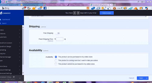
BigCommerce is a leading online eCommerce platform for individuals, small and large businesses that want a complete, turn-key solution to selling products online. The platform uses a control panel and series of tools to control products, pricing, payment, taxes, shipping and reporting. The BigCommerce team is very focused on continually optimizing the user experience. They contacted me to perform a detailed Behavioral UX and Usability testing audit to identify optimization opportunities.
During
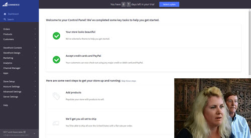
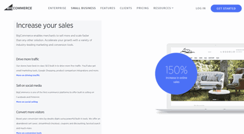
I evaluated the User Experience by analyzing the Behavioral UX data coming from their Google Analytics and related back-end systems. I next conducted usability testing with participants who matched their typical customers. Using the data from these evaluations, I documented a series of task-flow optimization opportunities and presented the results in a PowerPoint document with video highlights of the usability testing sessions. In addition, I created low-fidelity mockups of the potential new UX.
After
The final analysis report and videos were presented to a large meeting with the executives and division teams present. The results were used to re-evaluate the user experience and to prioritize the optimizations. Because the presentation was so well received, I was asked to conduct two more analysis projects. The first on the BigCommerce website. That analysis was also well received by BigCommerce. I was asked to conduct another evaluation, this one on the direct marketing Landing Pages.
List of Capabilities
- 5 Second Test
- A/B Tests
- Analytics Audits
- Behavioral Data Audits
- Card Sorts
- Content Audits
- Contextual Inquiries
- Eye Tracking
- Flowcharts
- Focus Groups
- Guerrilla Usability Tests
- Information Architecture
- Journey Maps
- Mockups
- Moderated Tests
- Multivariate Tests
- Persona Development
- Recruiting for Studies
- SEO Audits
- Surveys
- Unmoderated Tests
- Usability Tests
- UX Research Strategy
- Wireframes